Monday, December 29, 2014
Tuesday, December 23, 2014
Simple Stories - Stationery Gift Pack...

Hi there,
Hope you are well into creating your Christmas goodies!! I have a great little pack that can be used for Teacher Gifts, gifts for friends, family, students and colleagues.....
And we all love stationery don't we????? I think I am an addict!
Green, red, gold, poinsettia flowers - could you get any Christmasier?? (Is that a word?)
Thursday, December 18, 2014
Tim Holtz - Assembly Snowman - Square Christmas Card...
Sunday, December 14, 2014
Tuesday, November 25, 2014
Daydream with Prima Epiphany Ephemera.

Hi Guys,
Karen here with you again today. I wanted to share with you a tag that I made using one of the fantastic new Prima Ephemera packs.
Tuesday, November 18, 2014
Basic Grey - Herbs and Honey - Recipe Box
Friday, November 14, 2014
Worn Christmas Cover
It's November, and you know what that means.. the Countdown to Christmas is on.
Christmas is my very favourite time of the year. There is just something truly magical about Christmas. Even though for me, Christmas is normally spent at the beach, I would one day love to have a cold Christmas, or even better a White Christmas. Until then I will just have to make do with the gorgeous Christmas lines that are available..
Today I've got just the outside of my Christmas Journal to share with you. I am actually organised this year and have it finished before December.! ( well the cover anyway!)
There are so many options and choices of gorgeous Christmas lines out right now.. Í have of course gone with Vintage Christmas and some gorgeous Tim Holtz lines..
Thursday, November 13, 2014
7 Cards from One 12x12 Sheet

Hello,
I have been very productive with one sheet of paper! I created 7 cards.... I have seen other clever crafty people create more than 7 cards from one sheet - but I set myself a challenge - if I created an easel card and a square card, how many more cards (with decent sized pieces of the paper) could I make from this gorgeous sheet of paper from Basic Grey - Herbs and Honey range - "Radish"
The top two pieces on the left are the easel card, the middle piece on the right is the square card, bottom left is a regular sized card and I created 4 other cards using the other pieces.
Wednesday, November 12, 2014
Fit For a Princess!

Hi everyone, it's Sue Plumb here with you today sharing my latest creation.
I recently found this gorgeous photo of my daughter and her best friend that was begging to be scrapped, and I knew I needed some beautiful soft, feminine papers to do the job. And who does those papers better than anyone? Prima of course! So I rifled through my stash and found some papers from the Prima Princess collection, which were perfect for creating this project...
Wednesday, November 5, 2014
Prima Epiphany Collection..
Hi Guys.. Karen here with you again today.. I have to say I fell in love instantly with the new Prima Epiphany Collection.. it's a gorgeous collection full of girly grungy vintage goodness!
Some of the papers are just stunning.. so I chose a couple to make a very quick mixed media tag.. I teamed it with some sequins from the Prima Epiphany Ephemera pack, a bit of Tim Holtz jute string , Remnant Rubs and some glass glitter, beads and matte gel.
Friday, October 24, 2014
Basic Grey - Herbs and Honey - Recipe Book

Hello,
Recipe Books.... mmmm... I am sure I have at least 10! How many do you have and do you use them regularly or are you like me and always refer to the same basic meals from a variety of books?
Here is a way to keep all your favourites in the same book and of course there is plenty of space to add your new favourites as you collect them!
Tuesday, October 21, 2014
Coutdown to Halloween..

Hi Everyone! Karen here with you again today, for me the middle of September is a marker for a lot of upcoming things, birthdays, Halloween and of course Christmas.
Even though we are not big on the whole Halloween thing here in Australia, I absolutely love Halloween, and am happy for any excuse to get a little bit spooky!
So with that I mind I have a Halloween tag to share with you today, using of course you guessed it, some of my favourite spooky Tim Holtz bits and bobs!
Monday, September 8, 2014
Thursday, September 4, 2014
Fancy Pants Accordian Flip Album
Tuesday, September 2, 2014
Fancy Pants - Butterfly Birthday Cards
Wednesday, August 27, 2014
Fancy Pants - Be Different - Door Sign

Hi all!
Sue here today sharing something a little "different" I created recently using the 'Fancy Pants - Be Different' range. This creation was inspired by the July challenge at Off the Rails Scrapbooking challenge blog. It's not often I go "off the page", but the gorgeous little monsters on the 'Be Different - Monsters' paper were just BEGGING to be fussy cut, so I decided to create a sign for my twin boys' bedroom door.
{Believe it or not, this sign was actually created from the side of an old cardboard box!}
My "custom mist" was created using several drops of Donna Salazar Mix'd Media Inx Refill (mine was Verdigris), combined with water in a Ranger Inkssentials Mini Mister. (I love that I can create my own mists like this!)
Once the background was dry, it was simply a case of embellishing it. The words were all cut from the 'Be Different - Oh Boy' paper, whilst the monster characters were cut from the 'Be Different - Monsters' paper. There are also a couple of pieces from the 'Be Different - Ephemera Pack'. (I loooove this pack of embellishments, there are so many cool ones!) I mounted lots of my elements using foam tape to add dimension.
Here's how I created the background...
My "custom mist" was created using several drops of Donna Salazar Mix'd Media Inx Refill (mine was Verdigris), combined with water in a Ranger Inkssentials Mini Mister. (I love that I can create my own mists like this!)
Once the background was dry, it was simply a case of embellishing it. The words were all cut from the 'Be Different - Oh Boy' paper, whilst the monster characters were cut from the 'Be Different - Monsters' paper. There are also a couple of pieces from the 'Be Different - Ephemera Pack'. (I loooove this pack of embellishments, there are so many cool ones!) I mounted lots of my elements using foam tape to add dimension.
To add to the sense of fun, I also created a couple of little flags from paper offcuts and toothpicks, and used Dusty Attic - Barbed Wire chipboard, which was lightly coloured with Tim Holtz Distress Ink (Festive Berries). The border around the sign was simply washi tape folded over the edges.
I hope I have shown you how fun & easy it can be to create your own decorative items and that you might now be inspired to create your own. If you do, be sure to share it with us on our Facebook page HERE
Til next time, happy scrapping!
Cheers,
Sue P
Wednesday, August 13, 2014
Tuesday, August 5, 2014
Distress Spritzer
I want to share with you a few little things that I have found out while playing with my Tim Holtz Distress Marker Spritzer.
Now this thing is some serious fun to play with, but I found a couple of little things that are really important when you are using it.
The first one is to make sure that you have your marker tip extended a decent distance past the air hole on the spritzer. If it's not far enough you wont see any colour on your project - not matter how much you squeeze the bulb on the end.. I found this out the hard way...
This is how far I extend mine past the tip on the end, sometimes even a little further,
The next thing that is important to know is the difference in the closeness to the paper, and the how gently and the speed which you squeeze the air chamber at the end.
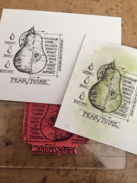
The picture below shows you the difference - you get a more spread out speckled effect when you have the marker further away from the paper, and use a gentle and slower pressure when squeezing the air chamber.
Whereas you get a far more concentrated effect when the marker tip is closer to the paper and you squeeze the air chamber faster and with more pressure.
Here I have used several green colours with a stamped image, after I finished spritzing the markers I sprayed the Distress water colour cardstock with a light mist of water, this blended the colours really well. I then fussy cut the pear and stuck in onto another piece of distress water colour card ready to use on a project.
The colours I used were:
I hope this has given you a little bit more info about the distress marker spritzers. Thanks for stoping by, hope to see you again soon.
Karen xx
Wednesday, July 2, 2014
Tuesday, July 1, 2014
12 Tags of 2014 - June

Hello everyone,
I have always been a big fan of everything Tim Holtz and have always included his products in my projects whether they be layouts or off the page. But I have never, ever made a tag. This month I decided to give it a go and it was a lot of fun....I truly was surprised at how fun it was.
Thursday, June 19, 2014
Tokyo Disneyland

Morning,
Disneyland is one of my absolute favourite places in the whole world!! I could spend days and days there! Sorry to say we had just over half a day there on this trip.....
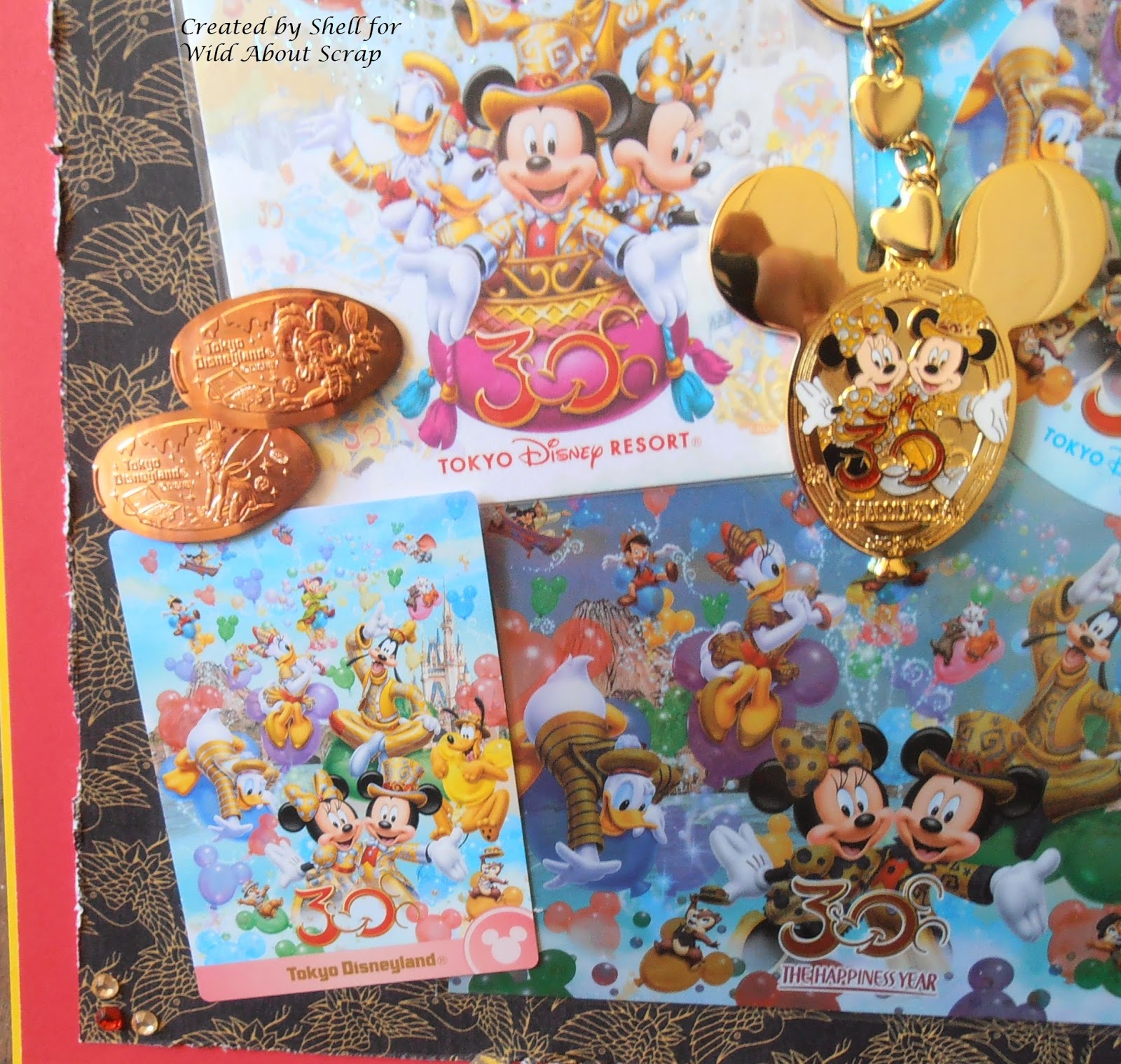
I have created two pages of Disney goodness to show you - first of all I would like to talk about some of my reasons for scrapbooking the way that I do. Since the digital camera has entered my life - (eek thinking about it - 10 years ago - shhh) I must have taken a squillion photos! So every now and then - not as often as I would like (sound familiar) I print out a few selected photos, scrapbook them and place them in albums for memory purposes - it is really enjoyable to sit down and peruse these albums. Also I like to collect postcards, brochures, tickets, other cards etc from trips or outings I have been on and create pages with these - which is what I have used to create these two layouts.
Inspiration: "Trinkets", stickers and postcards....
Collectors Cards, stickers and a photo.
To create these layouts, first, choose your background paper - I have chosen Graphic 45 - Bird Song Collection - Longevity. With this sort of scrapbooking - memorabilia - there is so many bits and pieces and there is already a lot of colour - I needed to choose a background paper that was not too 'busy'.
With this many elements to be placed on my layouts there was no need for any more embellishments other than what I had already collected. So, it was just a case of decide where you would like to place what and adhere them down!
I double layered the background page with a red layer and a yellow layer to draw your attention to the colours in the '30' as it is Tokyo Disneylands' 30th Year.
The "Happiness" Year.
Products used for these layouts:
- Graphic 45 - Bird Song Collection - Longevity
- Red and yellow plain 12x12 papers
- Rhinestones
Thanks for visiting!
Shell
xox
Subscribe to:
Comments (Atom)


